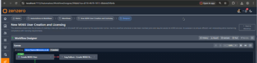
Workflow Designer
The Designer is the visual canvas where you build a workflow's steps and the connections between them. It opens automatically as the final step of the creation wizard, and you can reopen it any time from the workflow list.
The layout
| Area | What it's for |
|---|---|
| Toolbar (top) | Save, undo/redo, zoom, validate, test, history, submit for review |
| Canvas (left) | Your workflow's steps and the arrows connecting them |
| Configuration panel (right) | Edit the selected step's properties and parameters |
Adding and connecting steps
Add a step
Three ways to add a new step:
- Click New in the configuration panel.
- Right-click an empty area of the canvas → Add Step Here.
- Right-click an existing step → Add Next Step (creates a pre-connected step below).
Configure the step
With a step selected, fill these in the right panel:
| Field | Description |
|---|---|
| Step Name | What this step does, in plain English ("Create M365 user") |
| Step Type | Action, User Prompt, Nested Workflow, or Automation |
| Integration | Which system this step calls (M365, ConnectWise, TimeZest, …) |
| Action | The specific operation to perform |
| Parameters | Values the action needs (see below) |
Parameter types
Each action takes parameters. There are four ways to supply a value:
| Type | When to use |
|---|---|
| RuntimeInput | The person running the workflow fills it in (email, name, etc.) |
| ContextInput | Auto-filled from the ticket (tenant, client, ticket ID) |
| StepOutput | Use a value produced by an earlier step (e.g. user_id from a Create step) |
| Fixed | A hard-coded value that never changes |
Mark a step as Optional to give the runner a checkbox to include or skip it.
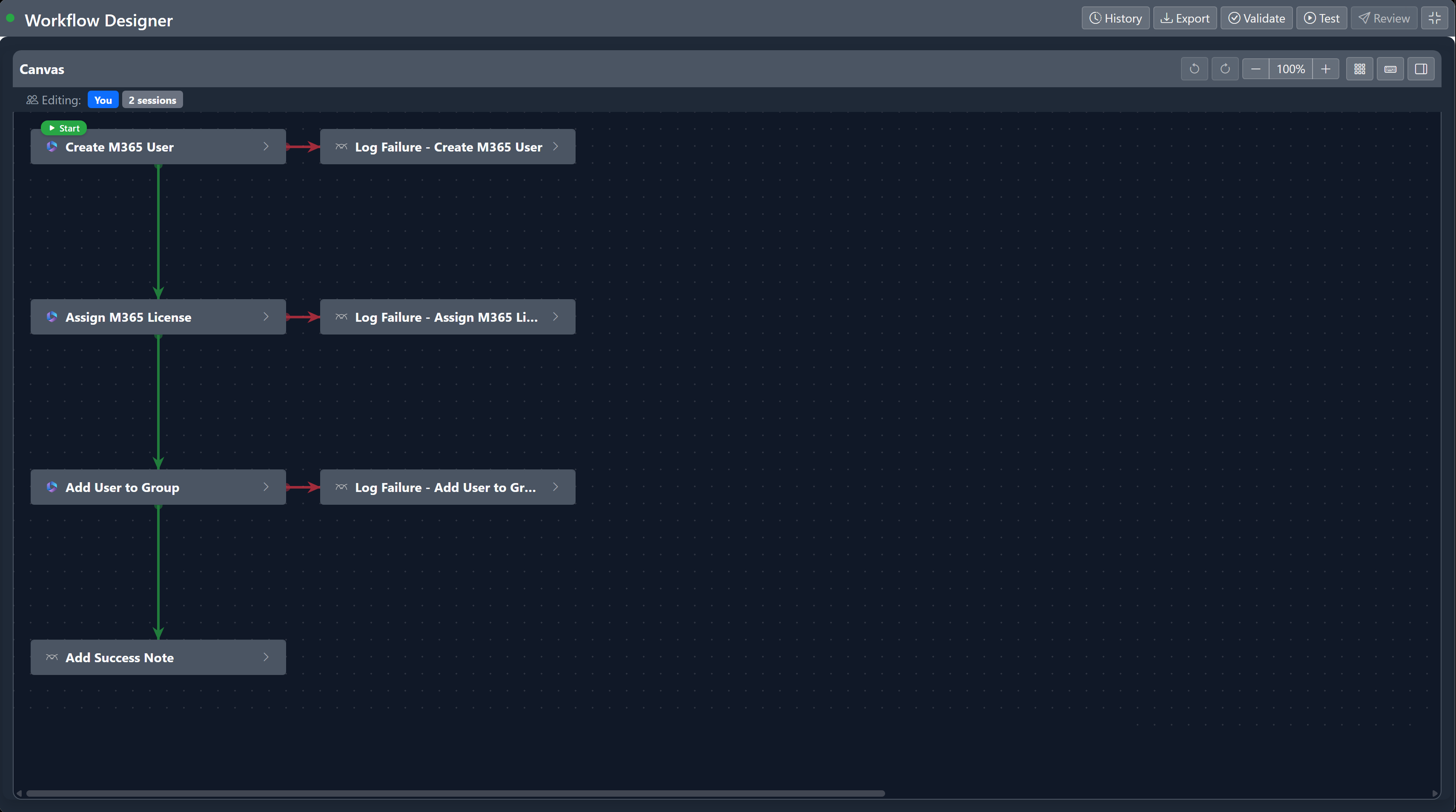
Connect steps
Hover any step to reveal four coloured dots at its bottom — one per connection type. Click a dot and drag to the next step.

| Colour | Type | When it runs |
|---|---|---|
| Blue | Default | Always runs after the previous step |
| Green | On Success | Only if the previous step succeeded |
| Red | On Failure | Only if the previous step failed (use for cleanup/error handling) |
| Orange | On Condition | If a value from the previous step matches a condition |
Conditional branches
The orange On Condition connection opens a modal where you pick:
- The source step's output property
- An operator (equals, contains, startsWith, isEmpty, etc.)
- The value to compare against
A single step can have multiple On Condition connections — each routes to a different branch based on what the source step returned. Useful for routing based on a user's response in a Yes/No or Multiple Choice prompt.
For Yes/No and Multiple Choice prompts, the branches and conditions are created for you automatically.
Edit or remove a connection
Click a connection arrow → an inline picker appears at its midpoint. From there you can change its type, drag the endpoint to a different step, or delete it.
Canvas tools
Auto-layout
After importing a workflow or making lots of manual changes, the canvas can get messy. Click the Auto-arrange button to lay everything out cleanly — parents above children, with consistent spacing.
Undo and redo
Up to 50 actions back. Ctrl+Z to undo, Ctrl+Y to redo.
Zoom and fullscreen
Ctrl+= to zoom in, Ctrl+- to zoom out, Ctrl+0 to reset. Click the fullscreen button (or press Escape to exit) to expand the canvas to the whole window.
Lasso select
Click and drag on an empty area to draw a selection rectangle — every step inside it is selected. Move them together with the arrow keys (hold Shift for 100px steps).
Copy, paste, duplicate
Standard Ctrl+C / Ctrl+V work. Pasted steps land at the bottom of the canvas with "(Copy)" appended to the name, and any outgoing connections are cleared so you can rewire them.
Workflow variables
Define a variable to pass data between steps or accumulate values across a workflow. Click the { } button in the toolbar to open the variables panel.
Reference a variable in any parameter using {{var.VariableName}}. Configure a step to Assign a value to a variable when it completes — choose Set to replace or Append to add to it.
Validate before submitting
Click Validate in the toolbar (or press V) to check for errors.
Errors you must fix before submitting:
- Missing workflow name or description
- Orphaned steps (no connections)
- Circular dependencies
- Required parameters left blank
- Invalid parameter configurations
Warnings (don't block submission, but worth a look): unused steps, optional-only branches, deeply nested structures.
Click any issue to jump to the offending step on the canvas — steps with errors get a red border.
Test runs
Click Test Run (or press T) to execute the workflow against test data without touching live systems.
- Parameters auto-fill with reasonable test values (random GUIDs,
testuser@example.com, etc.). - Click a step on the canvas to toggle force failure for that step — useful for verifying your On Failure paths.
- Watch live status on the canvas as each step runs (blue = running, green = success, red = fail, orange = warning, grey = skipped).
Versions and drafts
Every save creates a new version. Changes are kept as a draft until you save them — drafts persist between sessions, and other users see the last published version while you're editing.
- Save — publishes the draft as a new version (Ctrl+Shift+S).
- Discard Draft — the X next to the "Editing Draft" badge reverts to the last published version.
- History — open the version history panel in the toolbar to view, preview, or restore a previous version.
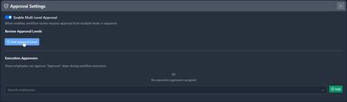
Approvals
A workflow can require formal approval before being activated, and individual executions can require approval at runtime.
Approval levels (at design time)
In the approval configuration:
- Toggle Enable Multi-Level Approval.
- Add levels — each has a name, a logic mode (Any One or All Required), and approvers.
- Levels execute in order — Level 2 doesn't start until Level 1 is complete.
Approval scopes
Approvers can be assigned at three scopes, resolved in this priority:
| Scope | Description |
|---|---|
| Workflow | Specific to this workflow (highest priority) |
| Pod-Client | Default for workflows in a particular pod + client combination |
| Pod | Default for all workflows in a pod (lowest priority) |
In-workflow approval steps
Add a User Prompt step with the Approval prompt type to pause execution mid-workflow and wait for an authorised approver before continuing.
Submitting for review
When everything's saved and validation passes, click Submit for Review in the toolbar. The workflow moves to Awaiting Review, approvers are notified instantly, and the workflow locks until reviewed.
The Submit for Review button stays disabled if you have unsaved changes or validation errors.
For the reviewer's side, see Review & approval.
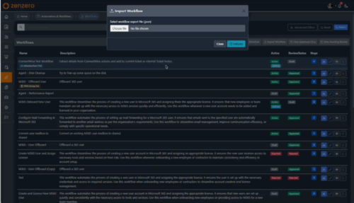
Export and import
Export any workflow as a JSON file from the toolbar — includes all steps, connections, parameters, and version info. Useful for backup, sharing, or migrating between environments.
Import a JSON file from the workflow import page. The system validates dependencies and flags any that are missing. Imported workflows always land as drafts so you can review before publishing.
Working with someone else
If another user is editing the same workflow, you'll see their avatar in the presence bar below the toolbar. Steps they currently have selected show a yellow border and are locked from interaction. Their changes appear on your canvas in real-time — steps move, new steps fade in, connections update.
If both of you save at the same time, you'll see a reload prompt — fetch the latest version and re-apply your changes.
Keyboard shortcuts
Press ? in the designer to see this list in-app.
All shortcuts
Navigation
| Shortcut | Action |
|---|---|
| Tab / J | Next step |
| Shift+Tab / K | Previous step |
| Esc | Deselect |
Move selected step
| Shortcut | Action |
|---|---|
| Up Down Left Right | Move 20px |
| Shift+Up … | Move 100px |
Editing
| Shortcut | Action |
|---|---|
| N | Add step |
| Del / Backspace | Delete selected |
| Ctrl+C / Ctrl+V | Copy / paste |
| Ctrl+Z / Ctrl+Y | Undo / redo |
| Ctrl+S | Save step |
| Ctrl+Shift+S | Save workflow |
View
| Shortcut | Action |
|---|---|
| Ctrl+= | Zoom in |
| Ctrl+- | Zoom out |
| Ctrl+0 | Reset zoom |
Quick actions
| Shortcut | Action |
|---|---|
| V | Validate |
| T | Test run |
| A | AI suggestions |
| ? | Show this list |
Where to next
-
Creating a workflow
Start a new workflow with the wizard.
-
Review & approval
What happens after you click Submit for Review.
-
Running a workflow
How users trigger the workflow you've just built.